Making Security Risk Understandable and Actionable
Security teams drown in data but struggle to answer a simple question: which users are actually putting us at risk?
As the founding designer at Dune Security, I didn't just design the product. I helped define what it was. The risk model I created became the centerpiece of our sales narrative. The experience I built changed how enterprise CISOs understood our value.
"I can't tell which users are putting us most at risk."
I spent my first weeks talking to CISOs, security admins, and our sales team. The same themes kept emerging: everyone had phishing results and training completion rates. Nobody had a unified view of which people were actually dangerous to the business.
No clear picture of who's risky
Everyone had data. Nobody had a unified view of which people were actually dangerous to the business.
Training wasn't targeted
Security teams care about the small set of high-risk users. They wanted focus, not floods of data for everyone.
Couldn't explain to the board
CISOs needed a risk story they could communicate upward. Opaque scores don't survive executive scrutiny.
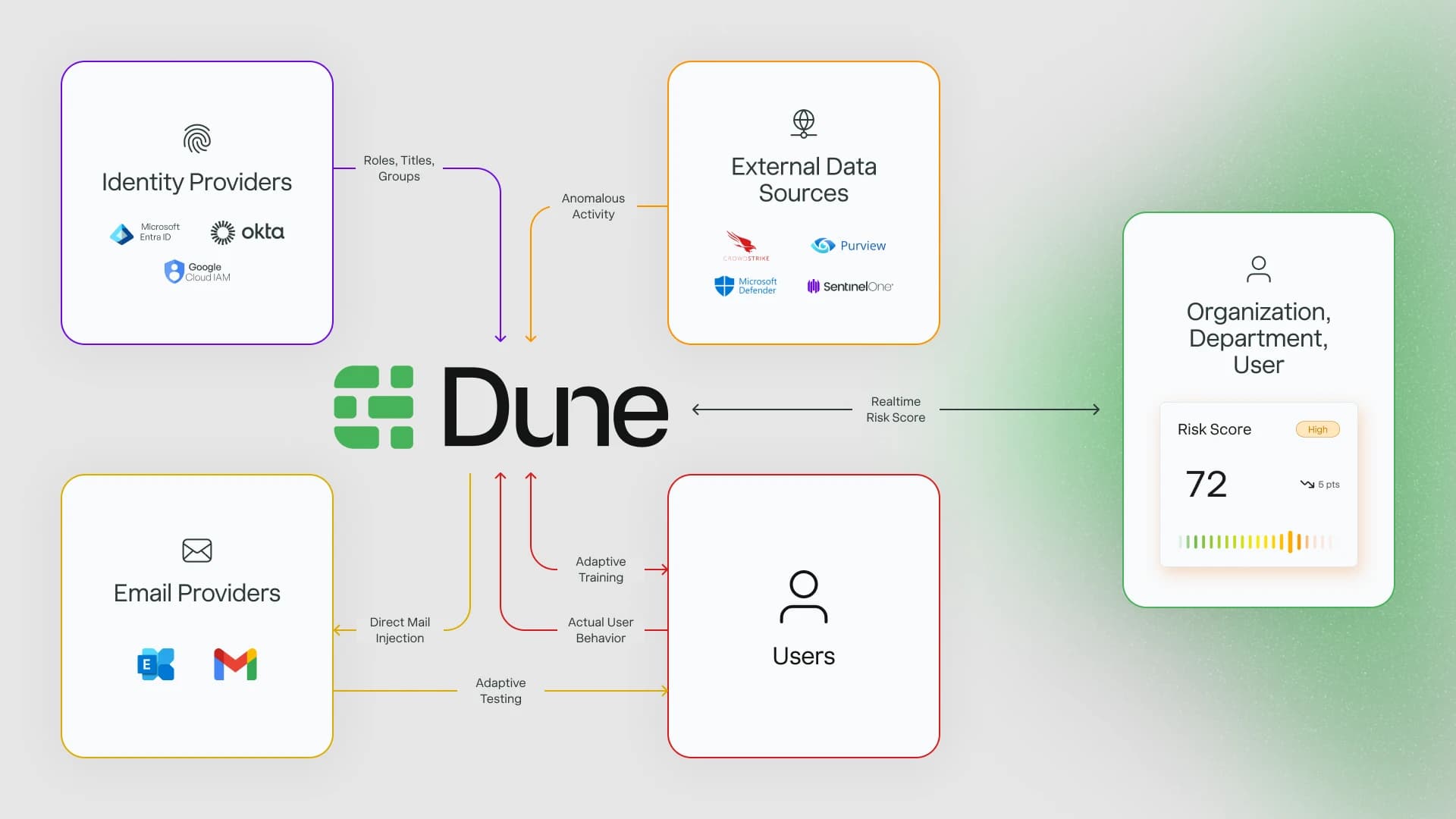
Designing a credit score for user risk
The original risk score combined multiple signals in ways that were mathematically valid but impossible to explain. When customers asked "why is this person high-risk?" we couldn't give a clear answer.
I pushed for a constraint: the model had to be explainable in four factors or fewer. Credit scores are read one at a time. Security admins look at thousands of users at once. Cognitive load matters.

The Four Pillars
Business Impact
Role, access level, what's at stake if this person is compromised. A CFO clicking a phishing link is different from an intern.
Simulated Attacks
Performance in phishing, spear-phishing, smishing, and vishing scenarios. Real behavior under simulated pressure.
Training Activity
Completion rates and recency. Are they engaged with security education, or ignoring it entirely?
Cyber Hygiene
Signals from connected tools: sign-in patterns, device posture, password behavior. The daily habits that indicate risk.
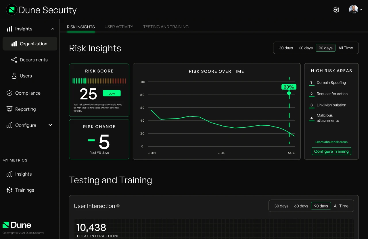
From dark and dense to clear and actionable
The existing UI was dark, dense, and organized around what we thought looked sophisticated, not what made security teams faster. Rather than fix isolated issues, I pushed for a full experience reset.

Before
- →Dark mode everywhere
- →Dense, card-heavy layouts
- →Navigation organized by feature
- →Color used as decoration
After
- →Light mode default, color reserved for meaning
- →Generous spacing, clear typography hierarchy
- →Navigation by job: Understand → Investigate → Configure
- →Color as signal (risk levels, status, actions)
One language, every zoom level
A CISO needs the org-wide view. A security admin needs the individual user view. The same data, different depths. I designed a consistent drilldown pattern where risk scores look the same whether you're viewing 10,000 people or one person.
10,000 users
500 users
1 person
Why they're risky
Design as product strategy
The four-pillar model changed how we sold the product. I worked directly with the GTM team to translate the pillars into sales enablement materials. The risk visualization became the first thing we showed in demos. It was our "aha moment."
The numbers
Seed round closed with investor materials I designed
Fortune 500 clients using the platform
Drop in dashboard-related support tickets
Increase in employee training completion

What I learned
Explainability beats sophistication
We could have built a more complex model with more factors. It would have been more "accurate." But accuracy that can't be explained is useless in enterprise software. The constraint of four factors forced clarity.
Design the conversation, not just the screen
A lot of my work was designing how sales would demo the product, how CISOs would explain it to their boards, how admins would discuss users with managers. The UI was just one artifact of that thinking.
Own the strategy, not just the execution
I ran the customer research, proposed the four-pillar model, and built the case for why this should be our priority. At early-stage companies, the best designers don't wait for requirements. They shape them.
Next Project
Stillsuit Design System →