Turning Sustainability From Awareness Into Habit
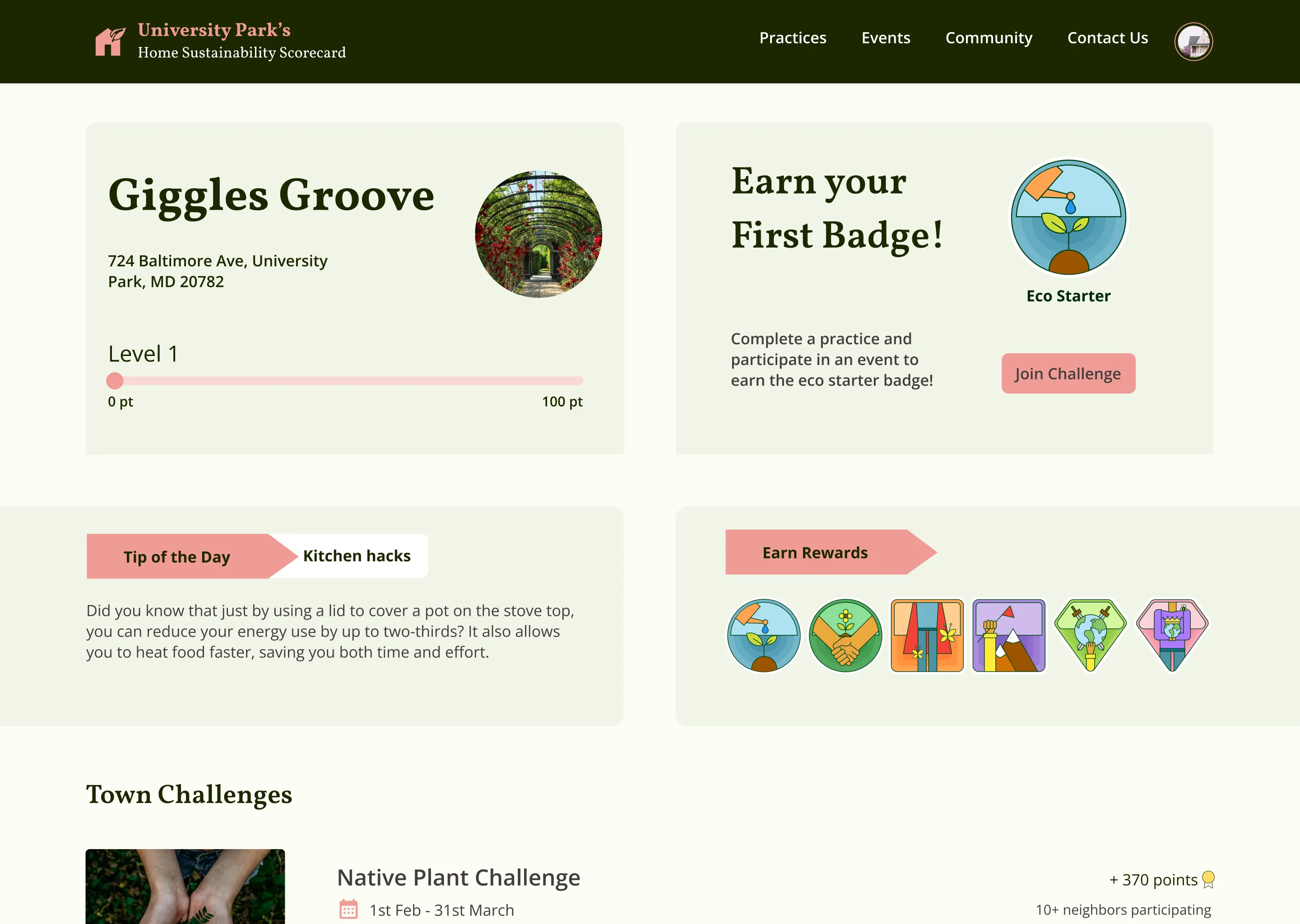
Most sustainability initiatives fail at the same point: the gap between knowing and doing. University Park had educated residents for years, but awareness wasn't converting to action.
As lead designer, I didn't just design screens. I defined the product strategy, ran the research that uncovered what was actually blocking behavior change, and built admin tools that let non-technical committee members manage the platform independently.
Information wasn't the problem
University Park's Sustainability Committee had the usual toolkit: newsletters, workshops, flyers. Awareness was high. Action was low.
The gap between "I know I should compost" and "I actually compost" wasn't an information problem. It was a behavior design problem.
Understanding the real barriers
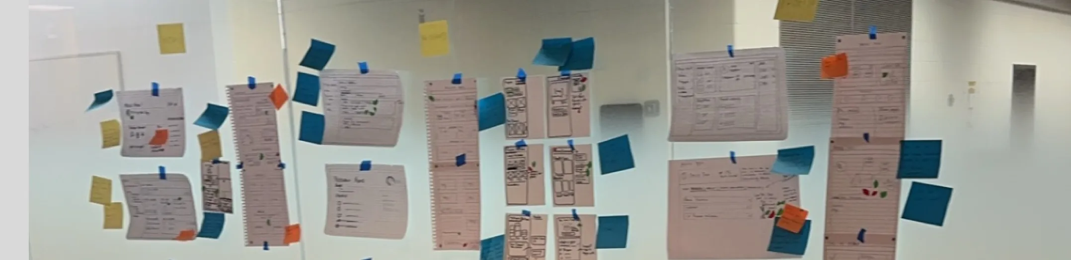
I spent the first sprint doing what most projects skip: understanding the real barriers through expert interviews, resident conversations, and committee workshops.
"I know what I should do. I just don't do it"
Residents weren't lacking information. They were lacking triggers, accountability, and a sense that their individual actions mattered.
"The committee can't see what's working"
There was no feedback loop. The committee had no visibility into which initiatives were gaining traction and which were being ignored.
"One size fits none"
A platform designed for sustainability enthusiasts would alienate beginners. A platform for beginners would bore experts. We needed progressive depth.
These insights reframed the project. We weren't building an educational resource. We were building a behavior change system.
Gamification grounded in behavioral science
Gamification has a bad reputation for good reason. Most implementations are shallow. Points and badges bolted onto experiences that don't need them.
But behavior change research says something different: when designed well, game mechanics align with how habits actually form.
Habit Loop (Duhigg)
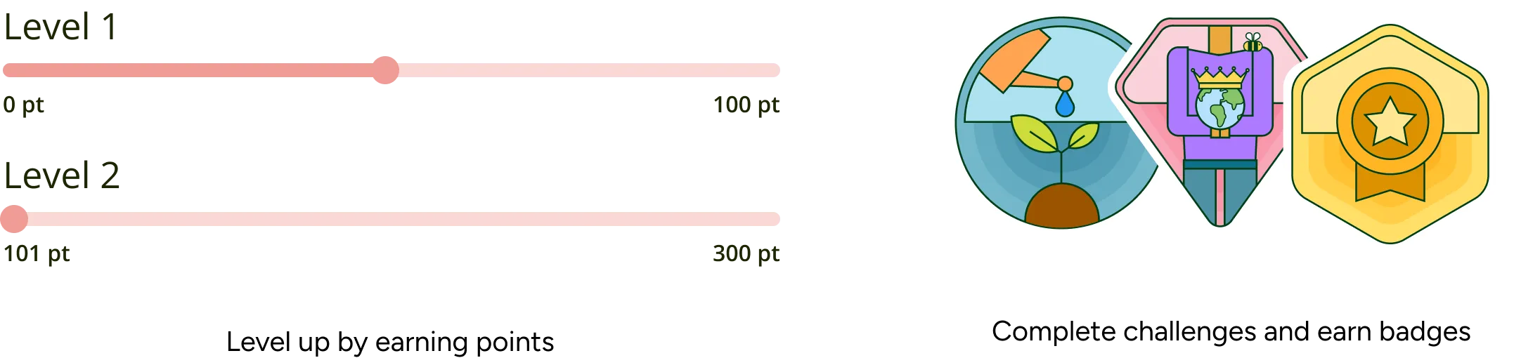
Cue → Routine → Reward. The platform provides cues (challenges), makes routines easy (bite-sized practices), and delivers rewards (points, badges, recognition).
Self-Determination Theory
Intrinsic motivation requires autonomy, competence, and relatedness. Users choose their practices (autonomy), level up (competence), and see community progress (relatedness).
Variable Reward Schedules
Predictable rewards lose power. The system includes surprise elements: bonus challenges, community milestones, seasonal events.
What we built differently
Practices over goals
Instead of abstract targets ("reduce your carbon footprint"), the platform surfaces specific, actionable practices ("Start a compost bin this week"). Each practice has clear steps and a defined completion state.
Progressive commitment
New users start with easy wins (switch to LED bulbs). As they build momentum, harder practices unlock. This prevents the overwhelm that kills most behavior change attempts.
Social visibility, not comparison
Community forums and celebration of wins, not leaderboards. Research shows comparison demotivates lower performers without improving high performers.
Physical-digital bridge
I proposed real-world rewards (garden plaques, recognition at town events) to extend the feedback loop beyond the screen. Digital points feel abstract. A plaque in your yard is concrete.
Life contexts, not environmental categories
I ran card sorting sessions with residents to understand their mental models. How did they categorize sustainable practices? What groupings felt intuitive?
The results surprised me. Residents didn't think in environmental categories (energy, water, waste). They thought in life contexts (home, yard, shopping, community).
At Home
In Your Yard
When Shopping
In the Community
This reduced cognitive load. Users navigate by context, not by learning our taxonomy.
Designing for non-technical maintainers
The Sustainability Committee would maintain this platform for years. But committee members aren't developers. If updating content required code, the platform would rot.
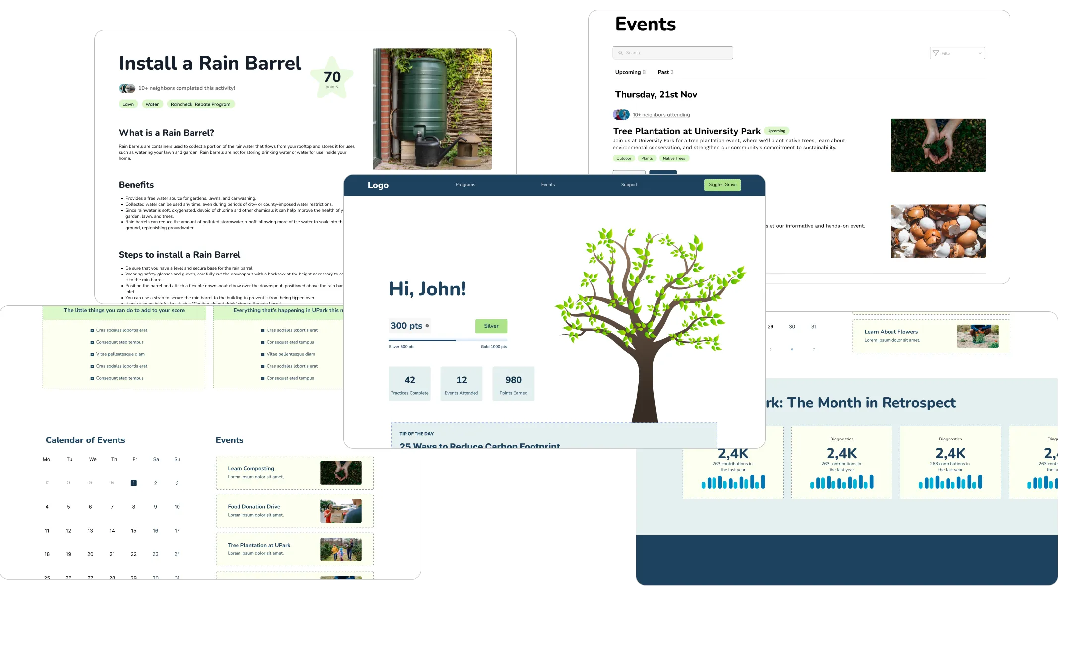
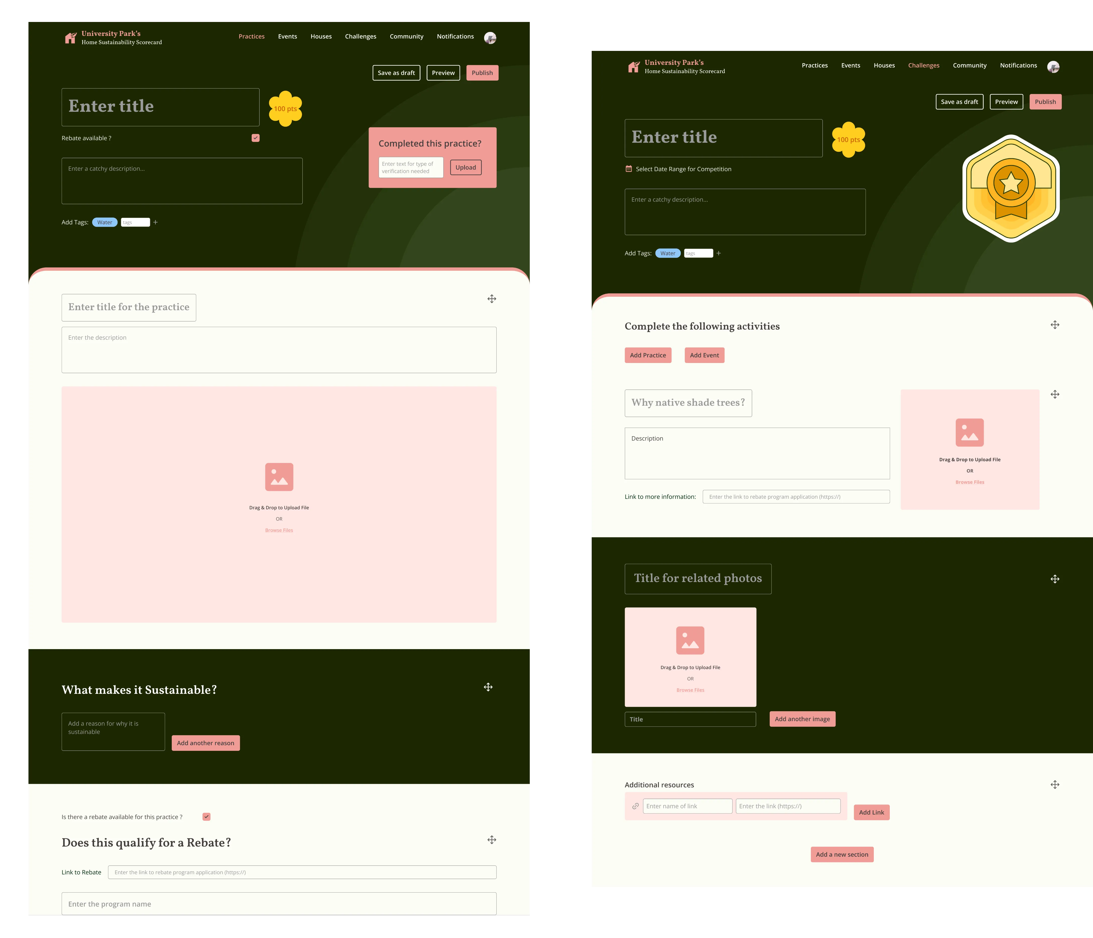
I designed a WYSIWYG admin dashboard that treated content management as a first-class design problem, not an afterthought.
Visual content editing
Admins see exactly what residents will see. No preview button, no mental translation from backend to frontend.
Metrics that matter
Actionable data: which practices have the most completions, which challenges are gaining traction, where engagement is dropping. Not vanity metrics. Decision-support data.
Guardrails, not freedom
Admins work within templates. This prevents accidental design breakage while still allowing content flexibility.
Testing with real residents
I ran usability sessions with 7 residents across different personas: enthusiasts, skeptics, beginners, tech-savvy, tech-averse.
Finding
Gamification confusion
Some users didn't understand what points "got" them.
Response
Added clearer explanation of reward system and how levels unlock.
Finding
Navigation uncertainty
"Where do I start?" was common.
Response
Added explicit onboarding flow and featured "Start Here" practices.
Finding
Admin complexity
Initial dashboard had too many options.
Response
Simplified to core tasks with advanced features hidden until needed.
From awareness to action
The platform demonstrated that civic technology doesn't have to be clunky or condescending. By treating residents as real users, not just recipients of information, we built something people actually wanted to use.
Resident adoption
Majority of targeted households engaged with the platform within first quarter
Committee independence
Non-technical admins managing platform independently within days of handoff. No developer dependency.
Replicable model
Other municipalities expressed interest in adapting the approach for their communities
What I learned
Behavior change requires system design, not just UX
Pretty screens don't change habits. You need to understand the psychology of motivation, design for progressive commitment, and create feedback loops that reinforce action. At the lead level, you're not just designing interfaces. You're designing systems that shape behavior.
Serve multiple audiences without fragmenting
Beginners, enthusiasts, and admins all needed different things. But building three separate experiences would have been unsustainable. The challenge was creating progressive depth: a single experience that meets users where they are and grows with them.
Design for maintainability, not just launch
A beautiful platform that rots six months after handoff isn't a success. I designed the admin tools as carefully as the resident experience because long-term impact depends on long-term maintainability.
Civic projects demand extra rigor
When you're designing for a community, not a company's users, the stakes feel different. People are investing trust in a public resource. That demands extra care in research, extra humility in assumptions, and extra focus on accessibility.
Next Project
Dune Risk Platform →